Innovation Sales Sheet
A while back, I got a request to take some existing copy describing a possible new feature and turn it into a sales sheet which would be used in casual 1-on-1 conversations with existing clients to determine their degree of interest.
My first step was meeting with the stakeholders and receiving an in-person summary of the intended purpose and goals of the to-be sales sheet, after which I was given access to the existing copy in a Google doc. At that point, my first intention was to understand the text by reading it through multiple times.

In reading through the copy, I tried to conceptualize how the text might lend itself to a visual narrative. Between reading and editing, I took my thoughts to paper to try sketching (in broad strokes) the overarching story the text was trying to tell. This required that I take initiative in emphasizing points which were important to the overall goals of the document, while other points were de-emphasized. I burned through lots of ideas by sketching them with pencil and paper.

Sketching helped lead me to understand how the copy itself could be configured into a narrative consisting of headings, subheadings, paragraphs, bullet points, and images. Granted, I had to inject a lot of my own interpretation into how this document should be presented and how the story should be told. This meant that, once done, I’d have to reconvene with the stakeholders to ensure my interpretations of the narrative were in sync with their own vision.
In order to better communicate my design decisions and vision, I started making my ideas a little more concrete by digitally wireframing my paper sketches. This resulted in a low-fidelity, digital document I could show to stakeholders to ensure they were onboard with the direction I was taking (it always seems easier to communicate my idea with a visual aid rather than to trying to describe it with words – as they say, a picture is worth a thousand words).

The reaction from the stakeholders was positive and they were on board with my direction and interpretation of the initial text.

With all the stakeholders on-board, a solid visual prototype in-hand, and a final version of the narrative complete, I dove into the designing a more fine-tuned visual version.
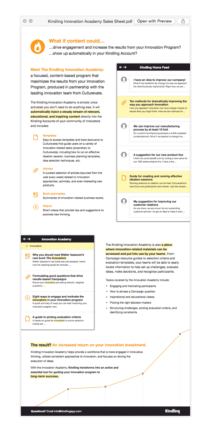
Initially, stakeholders had assumed the document would use modified screenshots of our existing application in order to communicate what this proposed new feature would be. But I argued that rather than use concrete screenshots of the product altered to fit our “theoretical” new feature, we should create a looser visual interpretation as to what the feature might look like. Because the actual specifications of the feature had not been worked out yet, screenshots of the existing product wouldn't serve as an accurate representation or description of what the feature could be. By using a more open-ended visual solution, existing clients could more easily understand the functions and goals of the new feature without getting hung up on the details of implementation (this held true for employees of the company as well). The idea of the feature was still very much in its infancy, so I argued that tying it down to a rigid visual interpretation at such an early, conceptual stage would actually be a hinderance to the feature in the future.
In the end, I came up with the following sheet which was used to have productive conversations with exisiting clients: