Designing Kindling’s Pricing Page
A while back, we at Kindling decided to put our software’s pricing schema online. Now, you might be thinking “You put your pricing online? Big deal.”. But up to that point in time nobody else in the “Sass enterprise idea-management software” space had done it. If you wanted to know how much the software cost, you had to get on the phone with a salesperson. So the answer to the question, “how much does this software cost?” was always “well that depends.” Depends on what? How much you were willing to pay, how big of a company you worked at, etc. The salesperson would feel that out on the call, then you would get a number. And usually that number was different from the next guy who called, and the next guy, and the next guy. You had to do “the dance” as our CEO put it.
Now that type of pricing doesn’t happen at the consumer level. If you go into a department store, find a shirt you like and ask the sales person “how much does this cost?” you’re not going to get a different answer from the next guy who walks in. The shirt costs what it costs, no matter your economic background, current employment situation, perceived socioeconomic position, etc. And consumer software is the same. When you buy an app on the app store, you buy it at a specified price that is the same for everyone. It’s clear, straightforward, and transparent. Unfortunately, enterprise Sass software just isn’t to that point yet. But as part of Kindling’s mission to transform the enterprise software space, we wanted to post our pricing on our website in a clear and transparent manner. In fact, our first piece of copy for the pricing page was our ethos:
We offer clear transparent pricing with additional, optional services. No hidden fees, no surprises. All enterprise software will eventually work this way, and we’re happy to lead the way.
That all sounds good and bold right? We should pat ourselves on the back for being such open people right? Well, having to actually design a pricing page made us discover that our internal, organizational sense of pricing wasn’t as clear and transparent as we thought. And it put our ethos about transparency to the test.
Our First Crack at It
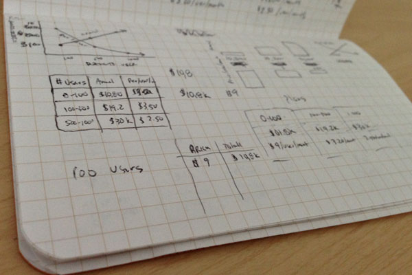
In order to design something like pricing, I needed a pricing structure. Turns out that getting our software pricing wasn’t as simple as I thought. It took many meetings of back and forth between sales, management, and other departments to even come to a consensus about what our pricing really was. At the time, we were doing pricing just like everyone else in the enterprise: if you wanted to know the cost, you had to do “the dance” with a salesperson.
We had many meetings and arguments, where each department argued about what worked best in their favor. Eventually we devised a few basic tiers for structuring our pricing, i.e. it costs X amount per year for X number of users.
That seemed pretty straightforward. But of course, there were a few exceptions to our pricing tiers:
- The software would be free for startup organizations, so that had to be represented and explained somewhere.
- If you were a huge organization that needed tons of users, we didn’t have pricing for you. For fish that big, the sales team didn’t want to disclose pricing. Instead, they wanted to discuss needs and options privately on a case-by-case basis. And they weren’t willing to budge on that point, which is completely understandable. The offering and services would be custom on that level, so the pricing had to be as well.
So, with those specifications in mind, I took our pricing tiers and began sketching out how to present the information.
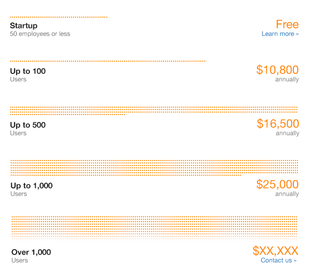
After a few sketches and rough ideas, I jumped to high-fidelity mocks (because deadlines, deadlines, deadlines) and quickly came up with a first draft of the pricing page that used a visual metaphor of volume to indicate our tiered pricing structure.
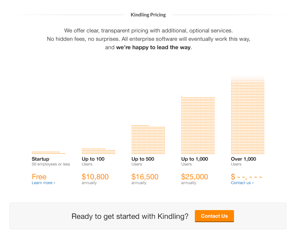
Seeing that our marketing site was responsive, the mock came in another variation indicating how the page structure would flow down on mobile. Rather than a vertical stack, things switched to be horizontal:
As is the case with most first draft mocks, these visuals seemed to cause more problems than they solved. Ok, maybe that’s not a fair statement. The mocks didn’t cause problems, but they did serve as a platform for having a conversation around pricing. It’s one thing to discuss pricing and then write it down on paper. It’s another thing entirely to see it communicated visually because different people are going to interpret it differently. Visual mocks have a way of raising questions you thought had already been solved, and this case was no different. The mocks served as a tool for advancing our own internal discussion around what we wanted pricing to be.
After these discussions, this first draft mock was thrown away entirely and I started on a second pricing page that was more aligned with our organizational thinking around transparent pricing.
Getting Complicated Before it Gets Simple
After the first draft mock, many questions around pricing were raised. There was white boarding, discussions, meetings, and finally some consensus about how to proceed with another version of the page.
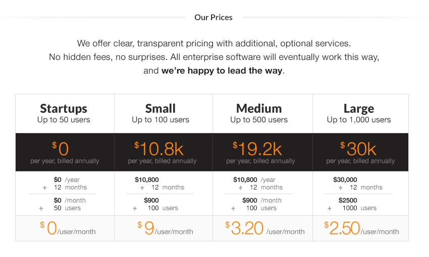
One of the biggest issues was how we wanted to display pricing. Because the software required an annual contract and was therefore billed annually, should we show the pricing as a flat, yearly number? That meant big numbers in the tens of thousands and some people inside the company were afraid that would scare off potential customers. So, one option was to break those numbers down into monthly pricing. “But wouldn’t that be slightly deceiving” some people asked, “because we weren’t actually billing you by month. Our whole ethos is clear, transparent pricing. So is showing a monthly pricing structure that is billed annually deviating from our mission of clear, transparent pricing?” Good question.
As is usually the case with organizational disagreements, we came up with a compromise. My task was to try and show both annual pricing and monthly pricing. It was like we were saying “ok here’s what it’s going to cost. We know, it’s a big number, so let us show you how that breaks down to a monthly cost.” And, as we had to learn once again from experience, compromises in meetings sound great but compromises in visual design are mostly just confusing. This is what I came back with:
We quickly discovered that trying to show both annual and monthly pricing breakdowns was too complicated. After more meetings and discussions we decided to simply show the per-month pricing. It felt better to show the smaller numbers so as to not scare people away, but we would indicate that it was billed annually. So, if someone really wanted to, they could do the math themselves and figure out the yearly cost. That led us to this design:
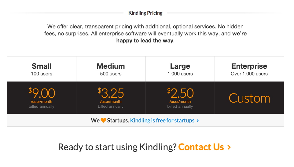
As the final design shows, we have monthly, per user pricing with a custom tier for large organizations and a slightly de-emphasized spot in the pricing table indicating that our product is free for startups.
The Results?
We launched this page shortly after arriving at this design and it was a big hit with potential customers. We had many potential customers get on subsequent calls with our sales people and praise us for our transparent pricing, saying things like “I was put in charge of finding idea management software for our company. After lots of research online, you were the only ones who gave us pricing on your website. It made my job so much easier.” This won us lots of brownie points with potential customers.
In fact, in one case, we even had a customer buy our software rather than one of competitors’ because our pricing was so transparent. They told us they had been researching and comparing offerings for months and were at the point of trying to get pricing quotes from each company. Our pricing was on the website, clear and simple. But our competitors were stringing them along in phone conversations and emails, not wanting to reveal their pricing until the last moment when they were sure they had squeezed every dime out of them they could. Eventually, this customer just said “screw it, we’ll just use Kindling because they are simple and who knows how much longer it’ll be before we even get pricing quotes from these other people.”
I find it interesting that we didn’t A/B test the more complicated designs that were arrived at via compromises. Instead, our mission guided our design and we ended up with a clear, transparent page design that helped bring in more customers. Sometimes I find a clear, high-level, strategic mission is a better guide to design than usage data around several different design options with unclear goals.