Creating iOS Icon Masks in the Browser
For some time I’ve been maintaining iOS Icon Gallery, a site dedicated to showcasing great icon designs from the iOS ecosystem. This post takes a look at just one aspect of front-end engineering for that site: how I recreated the rounded icon effect of iOS in the browser.
A Little Background on iOS Icons
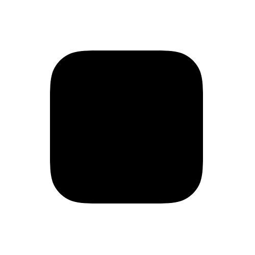
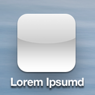
The icon shape in iOS is pretty, well, iconic. Just look at an icon’s silhouette you’ll think “iPhone”:
Within iOS, all icons must conform to this shape while being opaque. These constraints stand in contrast to other mobile operating systems, like Android for example, where icons can take whatever shape you want while being opaque or transparent. Hence, when creating an icon for iOS it’s not a blank canvas. There are constraints within which the designer must work. Some might see these constraints as arbitrary requirements that reduce creativity in icon design. However, I personally think we’ve seen the exact opposite over the years: an increase in icon design creativity. In an effort to create icons that stand out from the crowd, designers have gotten quite creative within the constraints of shape and transparency that Apple enforces on iOS icons. But I digress.
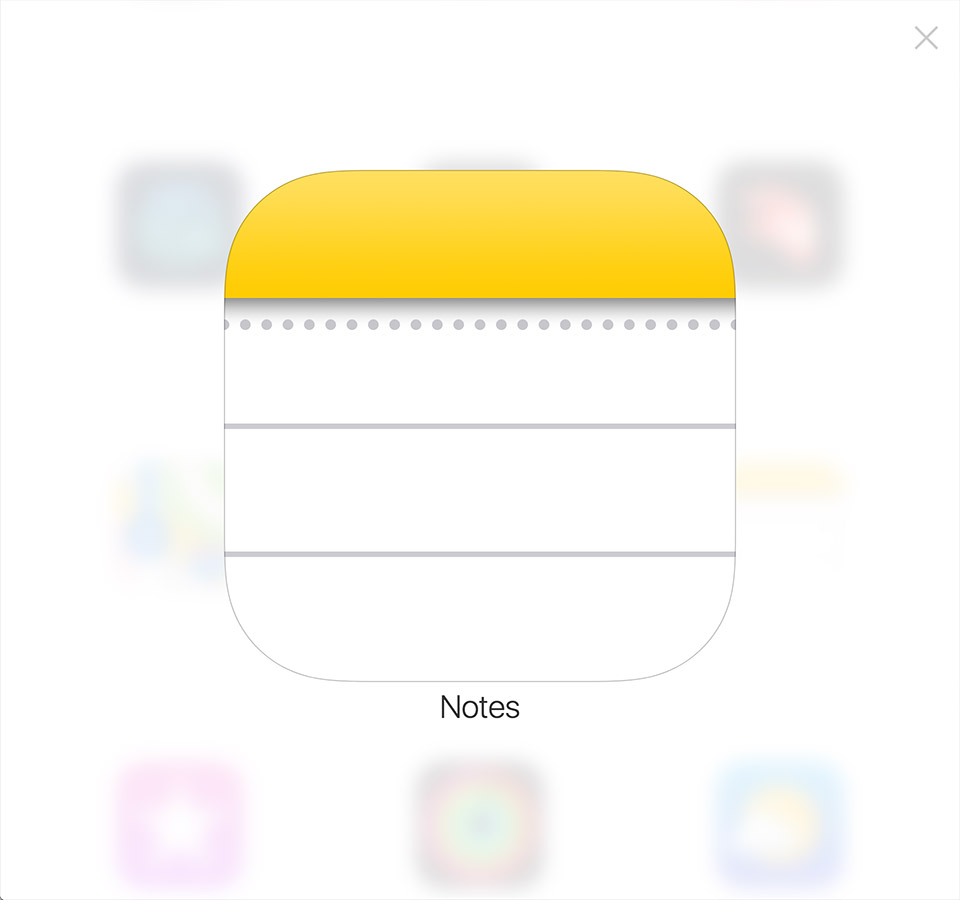
The point is that the actual icon artwork submitted by app developers is simply a square image. The masking of the icon artwork is defined and applied at the system level within iOS.
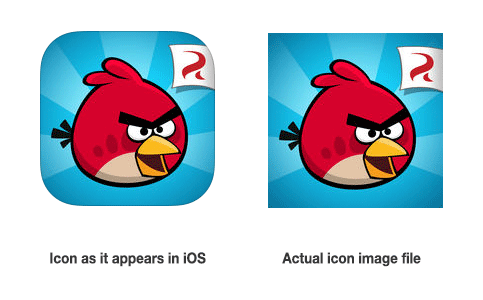
But what if you’re displaying an iOS icon on the web? Creating this same effect on has got to be easy right? ... RIGHT?!
How Apple Does It
So you want to display a bunch of iOS icons on the web. How do you do it? A good place to start is to see how Apple does it. If you search for an iOS app on the web, you’ll end up looking at one of Apple’s “iTunes Preview” pages (here’s Angry Birds as an example) where you can open the browser’s developer tools see how they display icon artwork using web technologies. So how do they do it? Each icon is an <img> tag. Adjacent to the image tag, there’s a <span class="mask"> tag which leverages CSS to load and position a mask image on top of the <img> element, thus masking the corners. If you remove the mask, you’ll be left with the original artwork.
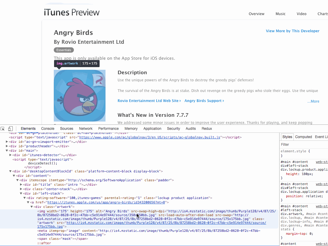
If you look closely at the <span class="mask"> and it’s background image, you’ll see it has three distinct pieces:
- A transparent area in the shape of an iOS icon
- A white, opaque background outside the transparent icon (this acts as the image mask)
- A 1px, semi-transparent inner border on the mask shape
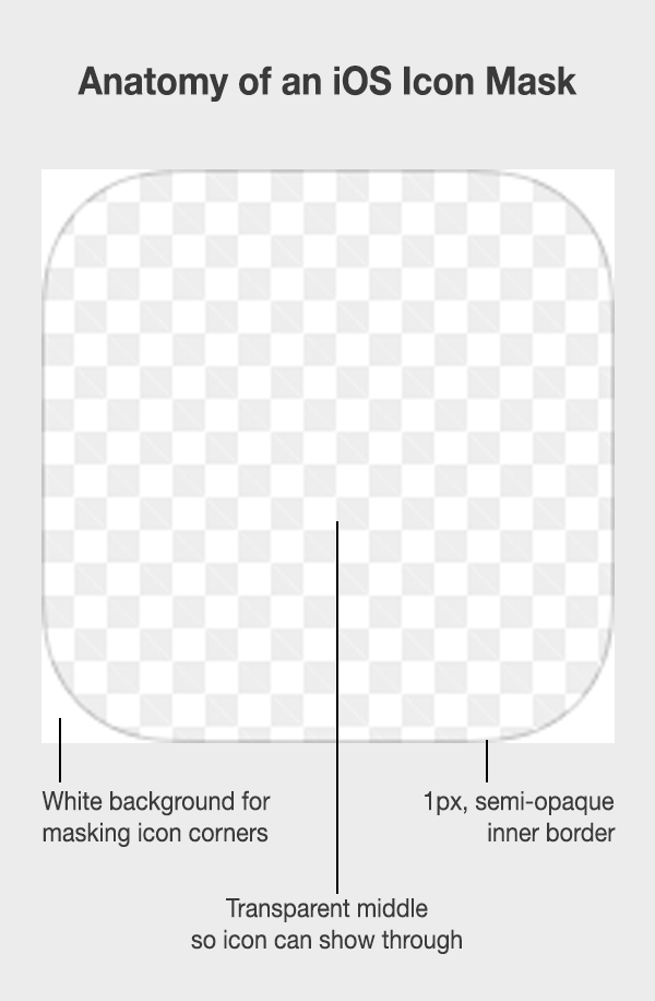
The 1px border is required because some icons are white. So if you didn’t have a border in the shape of the mask, you wouldn’t get that iconic iOS shape around the image.

Even for icons that aren’t on a pure white background, the 1px inset border still provides a nice aesthetic that varies in perceptibility based on the color intensity of the underlying icon.

How I Did It
When I first created iosicongallery.com, CSS3 properties like border-radius were just barely gaining support. I know it seems hard to imagine now to you kids today, but getting consistent cross-browser results for border-radius a few years ago was difficult. I remember using all the vendor prefixes and still seeing inconsistencies. For example, when applying border-radius to an <img> tag, some browsers would mask the image and thus hide the overflow while others would not. That seems like odd behavior in hindsight, but back then browser makers were figuring this stuff out as they went. Like many cutting-edge CSS properties today—especially vendor prefixed ones—inconsistency was (and is) the name of the game.
Anyway, I decided to take the approach Apple took and leverage a transparent PNG mask that would overlay the original icon artwork. I had to create a variety of sizes for these masks (1024px, 512px, 256px, 128px) since I was displaying icons at a variety of sizes on my site. Here’s an example of what my PSD file looked like:

Then Along Came iOS 7
Because icon masks are applied at the system level, Apple has been able to make programmatic refinements and tweaks over time to how icons are displayed in iOS. For example, pre-iOS7, icons used to have a mask as well an (optional) highlight applied by the operating system:
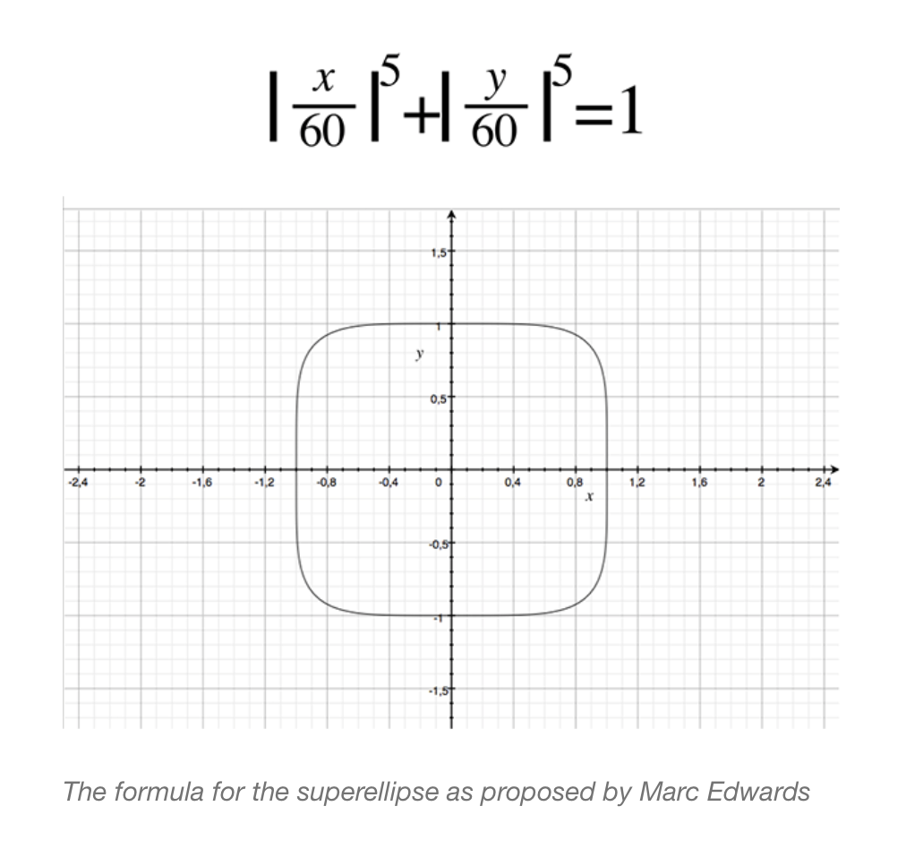
Additionally, in versions of iOS prior to iOS 7, the mask for an icon was essentially just a square with a border radius. However, with the introduction of iOS 7 the icon mask shape changed in a subtle way. Icon designers were some of the first to notice the change. They dubbed it the “squircle” (image courtesy of manbolo blog).

Before Apple officially released a template for this new icon mask, there was a lot of discussion in the design world about how to achieve this particular shape. Even sophisticated, mathematically-precise formulas for calculating the icon mask’s curvature at the corners were proposed. Here’s an example:
Eventually, Apple released an official (vector) icon template which helped designers everywhere know precisely what shape their icons would take within iOS. Side note: if you’d like to read an interesting proposition as to why Apple made this rather subtle change to their ubiquitos icon shapes in iOS, go read this article on curvature continuity.
With these changes in iOS, I needed to update the raster icon masks on iosicongallery.com to take the shape of this new “squircle”. You might be thinking, “but will anyone really notice the difference?” To that I would say: iosicongallery.com is a site primarily for iOS icon designers seeking inspiration. Pixel-level precision is something the site’s users will undoubtedly notice.
The Problem I Set Out To Solve
Using transparent PNG masks served as a viable method for mimicking iOS icon masks for a number of years. For a while I thought I’d be able to replace this raster image mask approach with an approach that uses border-radius directly on the <img> element, but with the advent of the “squircle” in iOS7, those hopes went out the window. However, my hopes and prospects for a more browser-native approach to image masking have improved as browsers continue to get better, but no concrete use case for ditching raster, transparent PNGs as image masks has surfaced...until now.
One of the things I was playing around with on my gallery site was the idea of a “quick preview” for a full-sized icon. Initially I thought, “well I’ll just throw the icon in a modal”. So playing around with it in the browser, I came up with this:

Do you see my problem with this approach? The main content of the modal, the icon, is sitting on top of a semi-transparent modal overlay. However, the mask of the icon is not transparent at all. This means that if any part of the icon mask is overlaying content underneath, you’ll see the white edges of the mask.

One of the other things I wanted to achieve with this “icon quick preview” was to mimic the blur aesthetic found in the newer versions of iOS. For example, when triggering the modal overlay, rather than just having a semi-transparent background overlay, I wanted to have it blur the underlying content. This actually wasn’t that difficult thanks to the advances in CSS. I was able to progressively enhance this aesthetic into my design by leveraging the filter: blur() CSS property. For modern browsers, this means you get the nice iOS aesthetic of blurring background content while bringing foreground content into sharp focus. However, as you’ll notice, this only further intensified the problem of overlaying an image mask on the icon, as the white corners of the mask became even more evident.

What I wanted, was a modal that looked like this:

The effect itself seems pretty simple. It’s just a masked image. Any graphics editing software worth a dime could do this. But the browser isn’t a graphics editing program and masking images in the browser (at least up until recently) wasn’t possible. This is precisely why I had to create the workaround described earlier in this post which positions a transparent PNG on top of the icon. Technically this approach isn’t real image masking but the illusion of an image mask, which is why I ran into the problem above when working with transparency. However, browsers have come a long way since I first implemented this pseudo-image masking technique. I’d heard rumblings of image masking in CSS but never had to actually use it, so this seemed like the perfect opportunity to do some research and figure out how to mask images natively in the browser.
Possible Solutions
My main goals for enhancing my current approach to masking iOS icons were:
- Do true image masking directly in the browser, thus avoiding any unsightly mask corners when icons are displayed on top of other content (or other colors besides white).
- Come up with a pixel-agnostic solution (likely with SVGs) so as to avoid the need to create @1x, @2x, and @3x versions of a raster image mask.
I sat down and gave the problem a few minutes of thought. I asked myself, “what are all the possible ways I could achieve a ‘squircle’ mask in the browser?” After some thought and quick Google searches, I came up with the following solutions:
- Apply the mask directly to the original source image
- Use
borderandborder-radiusin CSS - Use
clip-path: url(#mask.svg)in CSS - Use
mask-image: url(#mask.svg)in CSS
Directly Mask the Source Image
The idea here was that when I created a new post for my gallery, just save the actual image as a transparent PNG with the corners already cut-off in the shape of the squircle.
I didn’t want to rule out any ideas immediately, but this one was off the table as a solution as quickly as I’d added it. Apple applied the image mask at the OS level for good reason: it allowed them the flexibility to change icon masks in the future without having to generate new image files. This already had happened once when the icon shape changed from iOS 6 to iOS 7. And in the future it could change again and then all the source images for my gallery site would be outdated.
So this was a no-go.
CSS: border and border-radius
As discussed earlier, using the border and border-radius properties in CSS would be sufficient if we were dealing with pre-iOS 7 icons. But it wasn’t good enough for achieving the “squircle” shape. Now I know what you’re thinking “geez, come on, the difference between the two is soooo miniscule, nobody will ever notice the difference.” However, I would counter that notion with this: the main users of this site are designers and they literally make a living off noticing and making use of 1px differences. So I knew I had to achieve the exact iOS effect for the site to be of any use.
However, one useful thing I thought of when considering this option was that border and border-radius could work as a good-enough, graceful degradation fallback. In other words, if I could find a cutting-edge CSS property that allowed me to do native image masking in the browser whose browser support was limited to modern browsers only, border-radius seemed like a good fallback choice to achieve a “close-enough” iOS icon masking effect. After all, if you’re a modern iOS designer who painstakingly scrutinizes icon designs on a large retina screen but you use IE9, sorry dude, you get the “close-enough” version of the site.
CSS: clip-path
After doing a little research on image masking, I came across the clip-path property which seemed promising at first because of the relatively-good browser support for it. However, after playing around with it for a bit, I encountered a few problems that ended up being deal breakers.
First: the responsiveness of clip-path has much to be desired. In fact, it doesn’t really work. The objectBoundingBox attribute in SVG can fix this, but then you have to resize all your SVG units to be in 1×1 pixel ratio. Eric Meyer had a clever little workaround for this, but I actually could never really quite get it working (though in theory, it should have worked). In the end, I took Apple’s vector icon mask and shrunk it down to 1×1 pixels in Sketch and then exported it as an SVG to get my units correct. But even then I found other problems with clip-path.
Second: browser support for clip-path is complicated. Support appears relatively broad at first glance, but you have to be careful. There’s a difference between support for clip-path on SVG elements and support for it on HTML elements. clip-path is essentially just a rule that says “hey browser, mask this element with this image mask I have defined”. If you want to use clip-path inside an SVG element, browser support is really good. But that’s not what I was trying to do. I wanted to use clip-path on an HTML element (specifically an <img> element). For example, my usage would look something like this:
img.icon {
  clip-path: url(#mask.svg)
}
This is basically telling the browser, “hey for all <img> elements with the class icon, go get the mask.svg file and apply it as a mask to the HTML element.” Unfortunately, browser support for this varies considerably, even in modern browsers. In fact, even modernizr doesn’t support testing for clip-path in the way I need to use it. Modernizr does support testing for clip-path but their test looks for support on SVG elements, not HTML elements like I need (apparently it’s hard).
My best option for using clip-path and getting relatively consistent results would’ve been to define all my icons as <svg> elements rather than <img> elements. This would’ve looked something like this:
<!-- How I was doing icons in my HTML markup -->
<img src="/path/to/icon.png" />

<!-- How I could've done them -->
<svg>
    <image xlink:href="/path/to/icon.png" />
</svg>
If I went the route of defining my icons as <svg> elements, I could achieve an image mask by using clip-path inside the SVG. This would result in good cross-browser support because clip-path is well supported inside SVG. However, this approach felt wrong. Semantically it didn’t feel right to markup all my raster icons as SVG elements for the sole purpose of achieving a visual aesthetic. That kinda felt like the old web where we used leverage elements for style in HTML, like <bold> or <marquee>.
In the end, clip-path didn’t really work out for me because I didn’t have a reliable way to test for the HTML support I needed while being able to provide a viable fallback as needed.
CSS: mask-image
Eventually I came to mask-image, which is similar to clip-path but is designed specifically for targeting HTML elements. You target the element then specify your image mask (which can be a vector SVG), i.e.
img.icon {
    mask-image: url(#my-mask.svg)
}
Support for mask-image is relatively good for modern browsers. Plus it works great, as opposed to clip-path, because I can use it in conjunction with @supports in CSS, thus providing me a concrete way to test for support because every browser that supports mask-image also supports @supports. In this manner I could provide a fallback to border-radius when the browser can’t interpret @supports and mask-image. My final code looked something like this:
// For browsers that can't mask, just do a border and border-radius
img.icon {
    border-radius: 22.5%;
    border: 1px solid rgba(0, 0, 0, 0.125);
}

// For browsers that can mask, you get the squircle and a 1px border
@supports (mask-size: cover) or (-webkit-mask-size: cover) {
    img.icon {
        // Override the above borders
        border-radius: 0;
        border: none;
        -webkit-mask-image: url(/shared/img/ios-mask-512.svg);
        -webkit-mask-size: cover;
        mask-image: url(/shared/img/ios-mask-512.svg);
        mask-size: cover;
        // more stuff here...
    }
}
In the end, this solution worked great because it solved all my problems:
- Pixel agnostic? Check. Use an SVG to define your mask.
- True image masking? Check. The browser handles it all.
- Graceful degradation? Check. Just use
@supports
A side note
The trickiest part of this ended up being supplying the 1px border around the icon. When you use mask-image, your SVG is essentially just a shape that the browser uses to mask. You can’t have additional graphical elements in there. So to get that 1px border, I had to do a little extra work.
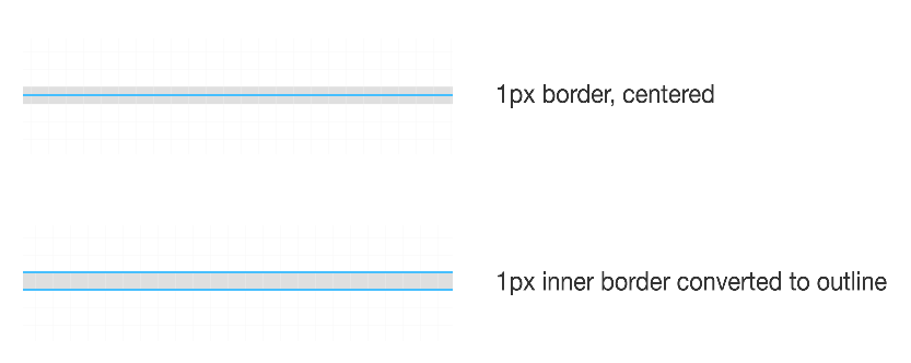
First, I created my image mask. I could define this at any size I wanted because I used the mask-size property to have the mask fill the dimensions of its parent. This was the easy part. I thought about doing the same thing for my mask’s border. Just define one size and let it scale. But there were a few problems with this approach. First, you don’t get to choose the positioning of SVG borders. They are always applied at the center (image courtesy of sketchapp).

The problem here is that I needed the position to be on the inside, so that the semi-transparent border could overlay the underlying content. This is the exact effect Apple used (via a raster PNG mask) and that’s what I was striving for in terms of pixel-level precision.
This meant I would have to create the icon mask borders myself. First I leveraged the vector icon Apple provides for the squircle shape. Then I outlined the mask with a 1px inner border in sketch, then converted that shape to an outline. Again, the reason it has to be outlined is because even as an “inner” border in sketch, it will end up as a “centered” border when exported to SVG.
The one downside here is that I had to export all the different sizes at which I was using the shape because, as outlines, if they were ever scaled in the browser they would scale below 1 pixel. I view this as an implementation detail that I will likely be able to resolve in the future once the SVG spec allows border positioning specification. If that comes to pass, I will be able to specify one shape with a correctly-positioned border whose shape can scale to any size. So one .svg file for all masks. However, for now, I have a simple export for all my SVG shapes I need.
These end up being displayed as pseudo elements on top of the actual icon’s <img> element. So the underlying icon image is natively masked by the browser and the 1px icon border is a SVG outline on top of it the icon as a pseudo element.
Conclusion
This was the long way of saying “How To Do iOS Icon Masks in the Browser”. I gave all the background information as a way of saying “don’t just take my word for it, but here’s how I arrived at the solution I propose here”. In the future, there are probably two more enhancements I’d make to this:
- More semantic markup: currently I have to wrap every icon’s
<img>element in a<span>in order to achieve the effect I want. Thisspanserves no other purpose than presentation but I need it for the icon mask’s border which is a pseudo element of thespan(since you can’t have a pseudo element on an<img>tag). - Define one border in SVG and apply everywhere, even in the case of responsiveness where the SVG shrinks
Hope you enjoyed this exhaustive look at doing (what seems like) a simple thing.
Update 2021-04-12
While you still can’t draw inner and outer border strokes in SVG, I did figure out a way to create a single iOS border shape that works across all my sizes. You can read more about it in my post “SVG Stroke Positioning, iOS Masks, and the Browser”.