Designing and Building the Assignment Desk Application
A recent project brought me in touch with Time Inc., the parent company of iconic magazines like TIME, Sports Illustrated, People, and more. In conjunction with one of my favorite front-end developers (damassi), we had the task of building a web application on an extremely tight deadline. A lot of the infrastructure was already in place in terms of a back-end service. Our task was to build a front-end layer for getting and putting data to this platform.
A lot of the decisions around the technology and stack for the front-end application were already made for us. They included:
- Use React.js
- Use Bootstrap UI framework (we ended up using react-bootstrap)
- Use a Bootstrap theme purchased specifically for this project
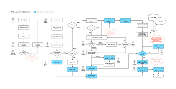
In addition to these mandates around technological tools, I was given a flowchart documenting the business process the application would be based on:
As well as a few rough mocks done by the project lead:
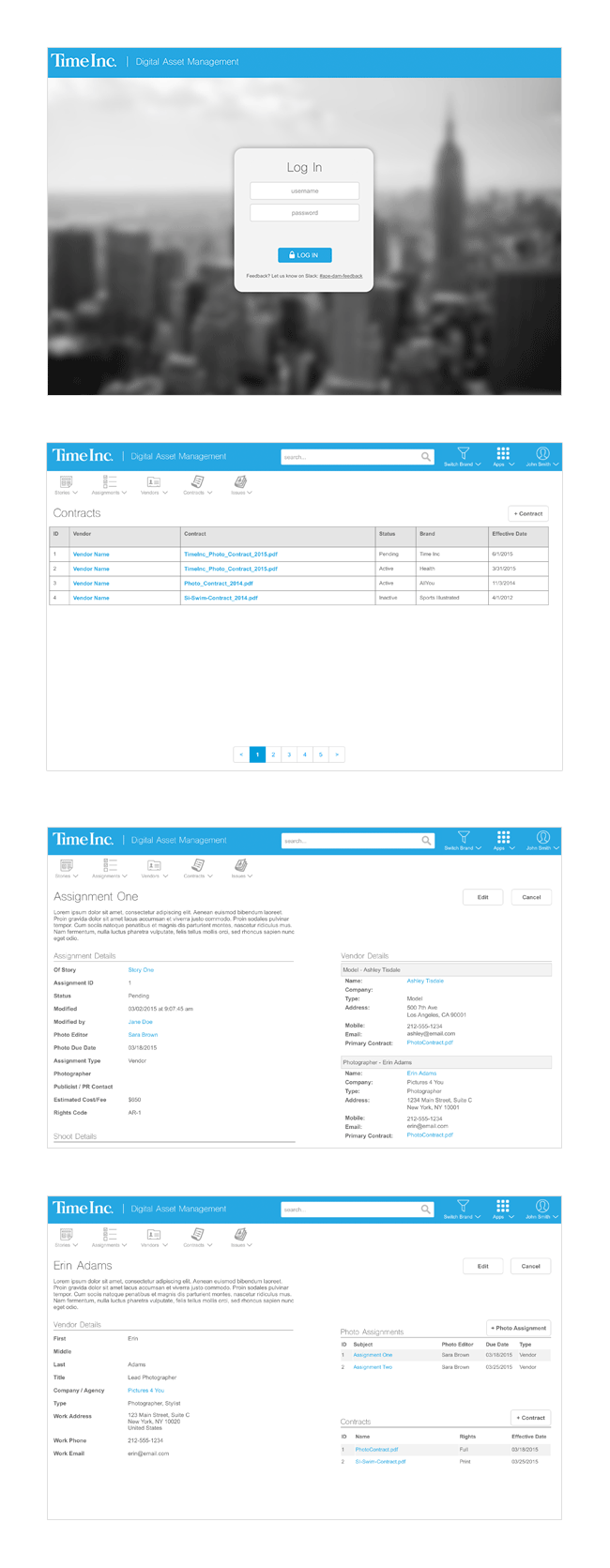
With this base, I began my design process by studying and understanding the mocks and flowchart. This helped me grasp the purpose of the application and the problems we were trying to solve. After a few conversations with the project lead around timelines, expectations, and other constraints, I realized that first iteration of this thing would essentially be a glorified database viewer — a simple UI experience around viewing and creating data from Time’s new platform for digital assets (all of this supporting the business process and needs of employees).
Architecting
In the first few days we had a lot of information being dumped on us about the project, from its history to its intended future. This overview of the project’s scope, in conjunction with the tight deadline, began to make the endeavor feel a little overwhelming.
Because so many of the expectations around this application were not actually specified anywhere in writing but were mostly shared conceptual ideas amongst different people, I decided the best way to start would be to begin writing it all down and get everyone involved to agree on it. And what better place to start defining a web application than its URL structure? The URL structure always helps define an app from both a technical and design perspective because you begin to fully see the entities that will exist in the application, their relationships with one another, and how you might navigate from one to the next. It also helps reveal which parts of the application may share similarities in design and functionality and which parts of the application may require their own unique solutions.
So I started with a simple .md file with notes around URL structure, view specifications, shared design patterns, and other questions I came up with along the way. Here’s an example excerpt of that:
## Unique Views

/ [login] - [home page -> assignments]


## Shared Views

/assignments              List view
/assignments/:id          Item view
/assignments/:id/edit     Create/Edit view
/assignments/create       Create/Edit view

/vendors                  List view
/vendors/:id              Item view
/vendors/:id/edit         Create/Edit view
/vendors/create           Create/Edit view

/contracts                List view
/contracts/:id            Item view (serve a PDF)
/contracts/:id/edit       Create/Edit View (can you edit an existing contract?)
/contracts/create         Create/Edit view


## List View Component Specs

/assignments
  - Table columns
    - Name (link)
    - Description
    - ID
    - Status
    - Due date (01/03/2015 format)
  - Table controls
    - Search
      - By what properties?
    - Filter
      - On what properties?
    - Sort
      - On which columns?

/vendors
  - Table columns
    - Name (link)
    - Agency
    - Type
    - City
    - Email (mailto: ?)
  - Table controls
    - Search
      - By what properties?
    - Filter
      - On what properties?
    - Sort
      - On which columns?

/contracts
  - Table columns
    - ID
    - Name (link)
    - Contract (pdf link)
    - Status
    - Brand
    - Effective Date (01/31/2015 format)
  - Table controls
    - Search
      - By what properties?
    - Filter
      - On what properties?
    - Sort
      - On which columns?
Writing these specifications down really helped me get a grasp of the design components I would need to come up with: list views, individual item views, “outside the app” views (/login, /logout, etc), system error views, and the like. Having it all written down somewhere was also very beneficial because I was able to go bring it back to the project lead and get sign-off while also gaining any further clarity from his perspective. This documentation helped serve as a reference for writing application specifications in Asana for development and testing.
Drawing, Wireframing, and Sketch(-ing)
Based on the specifications I had in writing, I began drawing sketches on paper to help better visually explain the navigation of the app, each entity’s relationship to one another, and the overall architecture (technically as well as from a modular design perspective). These drawings and wireframes helped produce buy-in and approval from stakeholders and allowed me to begin working on more high-fidelity mocks. It also gave our other front-end developer enough information to begin working on a project scaffolding in terms of the codebase. So my work helped get all the wheels churning asynchronously.
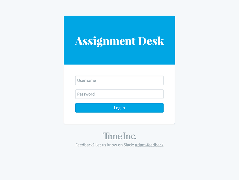
As I discovered many of the views could share designs components, I didn’t spend a lot of time in Sketch designing perfect mocks for each view. Instead I worked on a few simple views like login (/login), entity list views (/contracts, /assignments), and individual entity views (/contracts/:id, /assignments/:id) to get a general idea of aesthetics like layout, typography, color, etc. For example, here’s /login:
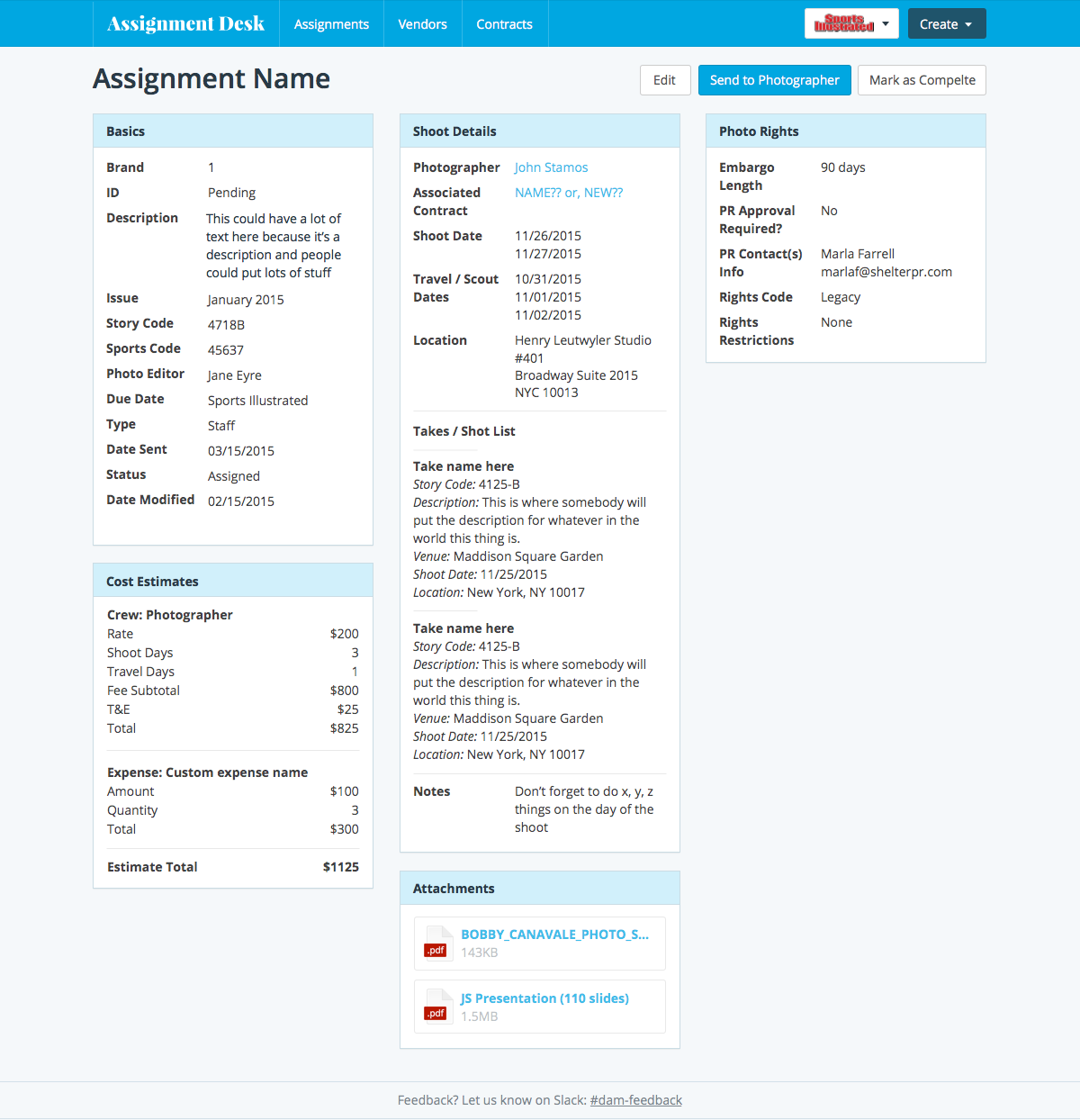
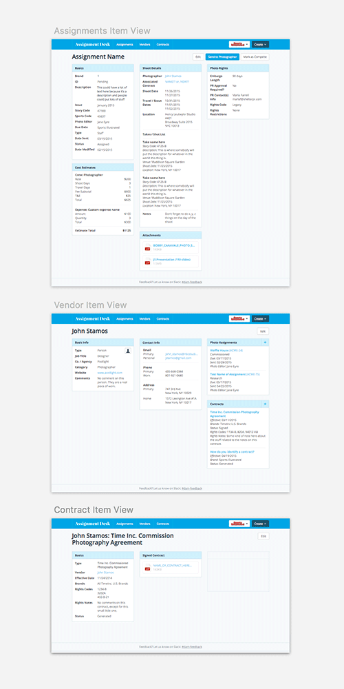
And here’s an example of an individual entity’s view (/assignments/:id):
And here’s an example of that single design pattern shared across three different entity views (/contracts/:id, /assignments/:id, and vendors/:id):
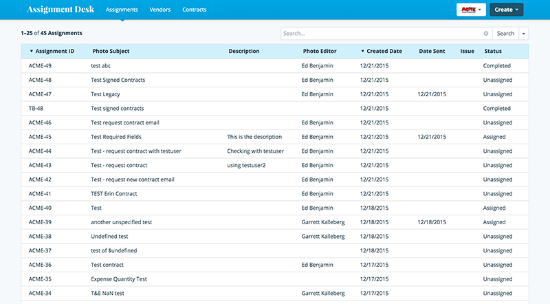
Another pattern that I discovered which easily lent itself to sharing design and code were the list views. They consisted of a table list of entities with controls like sort, search, and filter. I designed these views in such a way to easily share UI components, which not only helped reinforce a feeling of familiarity and consistent expectations for the end-user, but also helped cut down implementation cost when writing React components.
Here’s an example of the three completed list views (/contracts, /assignments, and /vendors) being navigated in the browser. Notice how their component design easily shares UI patterns as well as code (this same type of pattern and code sharing was done for the “Create” and “Edit” views for each entity):
Once I had static mocks in a nearly completed state, it was an asynchronous process of implementing them in tandem with the other front-end developer. I was writing CSS and React components to bring each of these mocks alive, while the other developer was wiring the flow of data from the back-end to the client. I essentially designed and coded the view layer of the application, while the other developer implemented things architecturally.
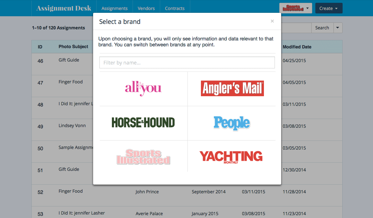
At times I would dive back into Sketch to figure out the designs for individual components of a page. For example, one of the widgets we were required to build specified that the user be able to select different brands and view content in the application based on the selected brand. For this, I designed a button in the application bar with the current brand’s logo (which provided brand context to the page’s content) that, once clicked, provided a modal where the user could change their brand context based on brands available to them:
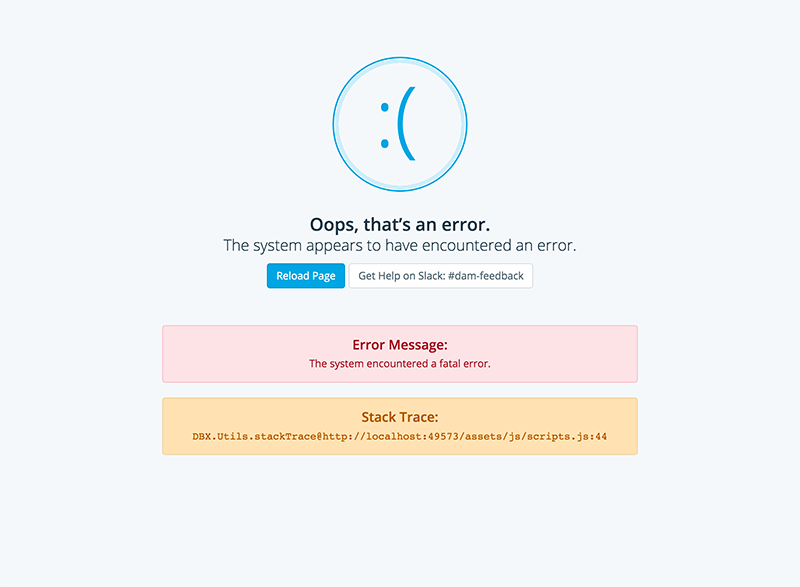
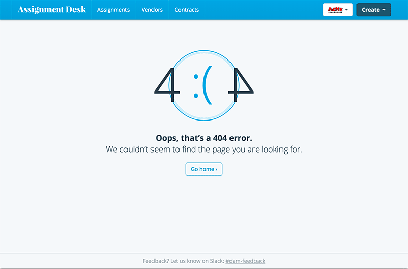
There were also other views that I jumped into sketch to design before implementing in the browser. This included views like the system error and 404 pages, where I spent a little time refining an “Error” graphic:
As you can see, this project demanded a kind of a “as you go” process. A lot of the visual style was developed up front in Sketch (in accordance with preset visual brand guidelines from the client) based on a few basic views, and then each succeeding view or component was built upon that visual groundwork as new requirements and features came in from the project lead. As such, my sketch files weren’t necessarily the “set in stone” visuals of the app, but more of a sandbox for discovering and refining the aesthetics of component parts. These mocks would serve me as guides for implementing each component or view in the browser. Additionally, they would also serve as visuals to convey the direction of the product to stakeholders.
React(-ing)
As far as the code side of things go, the app itself was architected by our senior react developer while I wrote most of the view layer of the application. For example, one of the shared patterns across individual entity view pages was the attribute-value list (.attr-val-list HTML class). It is a simple representation of attribute-value pairs of data, grouped under an entity’s rubric.

This module had a few different variations, which were styled by applying class name variations in on the parent list element.

At their most simple level, each attribute-value list item was an <li> element whose logic was extracted into a shared React component. This allowed me to easily make tweaks (in both HTML structure and CSS styles) in one file and see the changes reflected across multiple entity views. For each data pair, I wrote a <ListItemPair /> component and used that to pass in individual parameters:
<ListItemPair
  attr='Type'
  debug='$type[0].id'
  val={type}
/>
The debug parameter (when in development mode) would take the place of the value as a kind of flag to indicate when the value was empty and where it was being sourced from. This made debugging for our team much easier. The component definition for the <ListItemPair /> that I wrote looked like this:
render() {
  const { attr, val, valIsHtml, inPhotographerEmail } = this.props;
  const html = { __html: val }
  return (
    <li>
      <div className='attr'>
        {attr}
        { inPhotographerEmail &&
          <PhotographerEmailIndicator /> }
      </div>
      <div className='val'>
        { valIsHtml
          ? <div dangerouslySetInnerHTML={html}></div>
          : val }
      </div>
    </li>
  )
}
There are a couple additional parameters you might notice here. These served as optional flags to help indicate what kind of content we were trying to represent. At the most basic level, the attribute-value pairs were simple text. But sometimes a value needed to be a react element, or perhaps raw HTML (in the case of an address field, for example), so these cases were accounted for with optional props.
 or raw HTML (addresses with line breaks)")
This is just one basic example of the many components I wrote on this project. Because I was able to think in terms of react components at the design stage, it was much easier to fit UI pieces together while accounting for slight variations in each component part. This is one thing I really like about React: you can think of designing your UI modules in visual and functional terms at the same time. The fine details of the aesthetics can be figured out in Sketch and the technical details of code can be figured out in your code editor, each in their respective time and season during iterative process of making your application.
This is why I love sitting the fence between design and development — it can be a ying/yang process. Each side tugs and pulls on the other, influencing how the other comes into being. It helps you discern when to unify some differences and when to make others differences more pronounced.
Style Guide(-ing)
Because this project had the additional scope of serving as a boilerplate of sorts for future applications that would communicate with the client’s back-end platform, I also developed a kind of style guide (well, at the time of publishing this post it’s still a work in process) which would serve as a benchmark for keeping visuals consistent across other applications that would be built in the future.
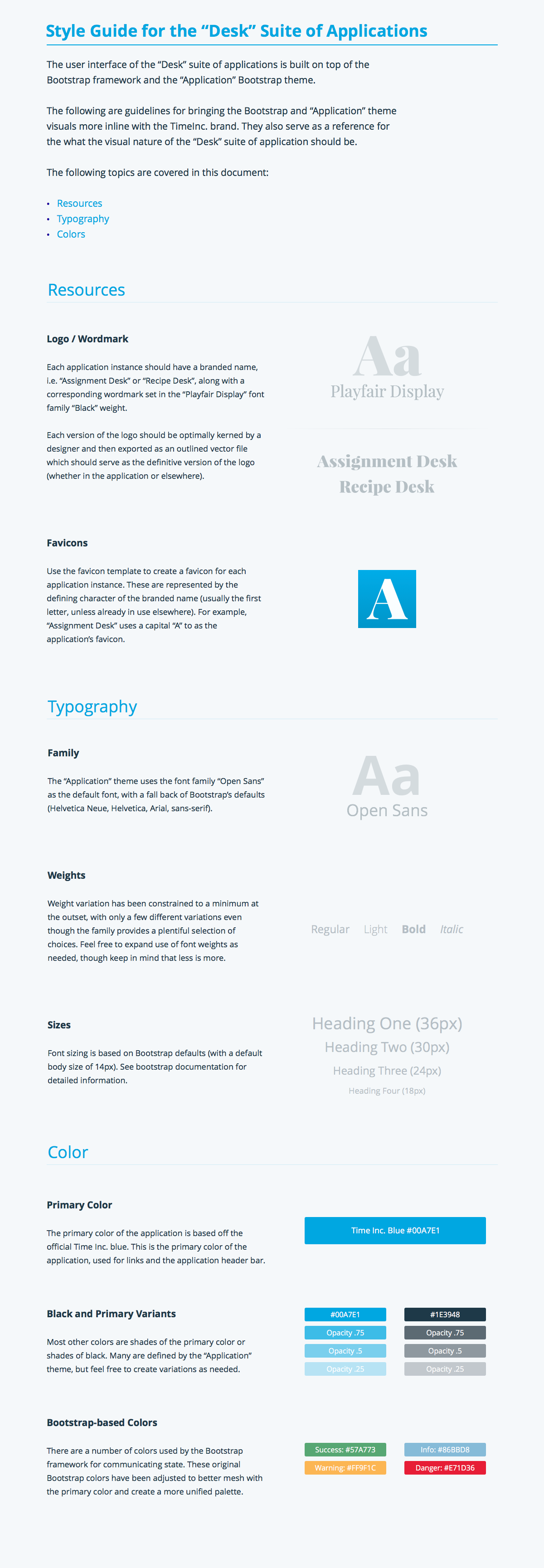
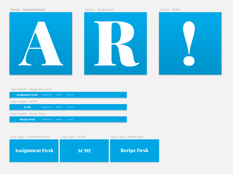
Additionally, I put together a resource kit of sorts that allows designers coming after me to easily find and export assets for existing applications. It also serves as a template for creating new application assets based on existing style guidelines.
Conclusion(-ing)
It was really neat to see how quickly we could build this app. Granted it wasn’t a beast in terms of complexity, but that was partly because we made it that way. Up front we had to cut anything that was unnecessary and unify any patterns we could in order to ship something as fast as we did.
Now that we’ve launched, the application has taken a more product-centric approach of getting user feedback and incorporating it back into the application while simultaneously figuring out ways to improve and enhance the basic design and functionality the app was built on.