Assignment Desk Logo
At Postlight I’ve been working on an internal application for a large enterprise company. In a nutshell, what we’ve been doing is updating their current internal software (which looks more than a decade old) to a modern web application. A small part of what my teammates and I are bringing to the table is a sense of holistic design consistency where we argue for a product-centric approach to designing the application to help imbue it with a sense of care.
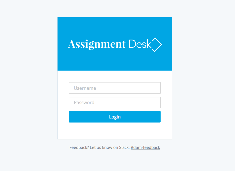
Part of this effort meant we needed to “brand” the application we were engineering. We ditched the corporate-y name it had by default and came up with a new one based on the application’s purpose. We called it “Assignment Desk”. The Assignment Desk is a place where the clients’ employees and contractors create “Assignments” for one another in order to collaborate and get work done.
Because of other constraints on the project, the idea was to create something very simple. This wasn't going to be a logo design for a Fortune 500 company with large exposure. Mostly, it would simply be a visual word mark for the application, along with a possible abstract shape. It would be a MVL: minimum-viable-logo.
Oh, and the timeline was about one work day.
Sketching
I started by trying to sketch out some ideas. This included not only sketching letterforms and shapes, but finding synonyms for the words I was working with in order to better understand what concepts could be conveyed through a visual mark. This allowed me to get a sense of the letterforms, their length, their relationships to one another, and their possible meanings. Sketching also helped me try out some visual shapes that might work in combination with the name. Mostly, the sketching helped me burn through all of my bad ideas and find a really solid place to start thinking about what this logo might be.
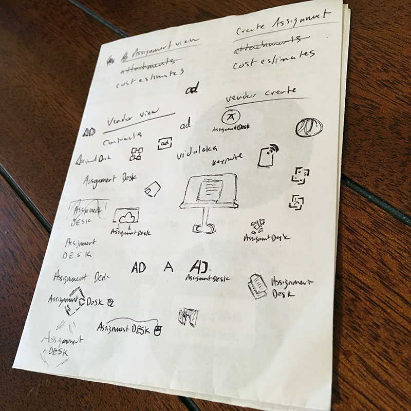
Playing with letterforms
Once I was finished with sketching, I had a much better idea of what I wanted to logo to be and convey, but perhaps more importantly, I had a better idea of what not do with the logo. So at that point I began trying different combinations of font families based on the brand identity of the parent company (thinking it might help convey a sense of relationship amongst the parent company and its products).
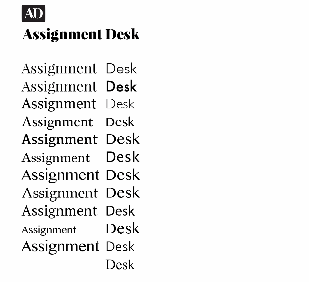
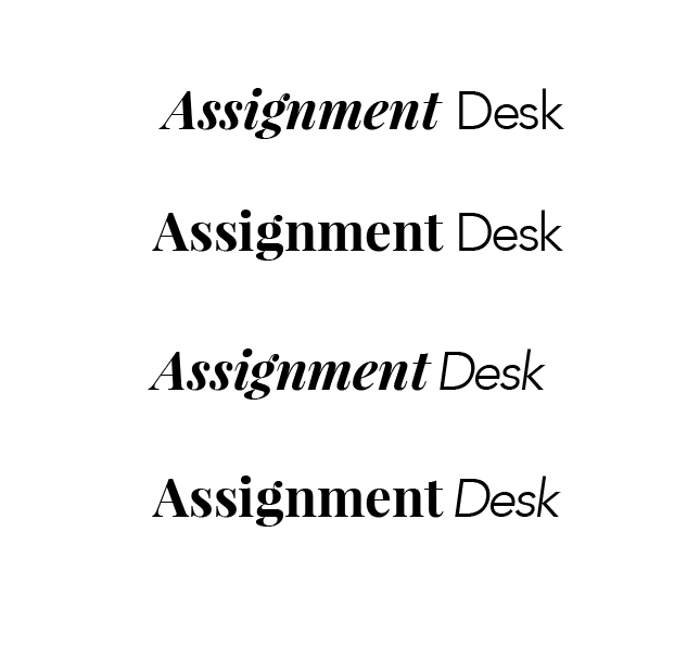
Once I found the font families that I felt fit well together aesthetically, I began trying different combinations within each respective family until I found a few variations I liked.
Incorporating shapes
Once I had the font combinations I liked, I tried incorporating a few of the abstract shapes I had discovered during the sketch phase to try and discern what worked well and fit with the chosen font combinations.
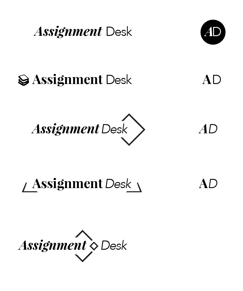
I liked the simple shape of a square for this particular project. Not only was a good choice under my time constraints, but it also served as a visual metaphor for a physical desk. After deciding on the square, I tried a few different variations on the shape itself trying to decipher what would work best:
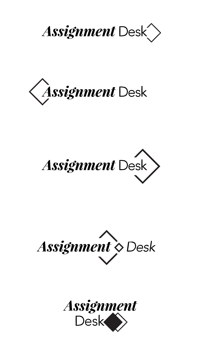
I found the square as an extension of the word “desk” to work really well visually. So I tried a few more typographic combinations with it:
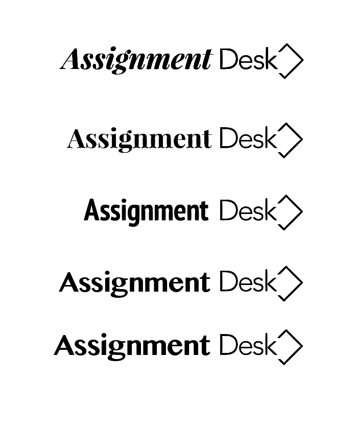
And then there were two...
After playing with shape and font combinations, I narrowed down my options to two finalists: a serif and a sans-serif version:
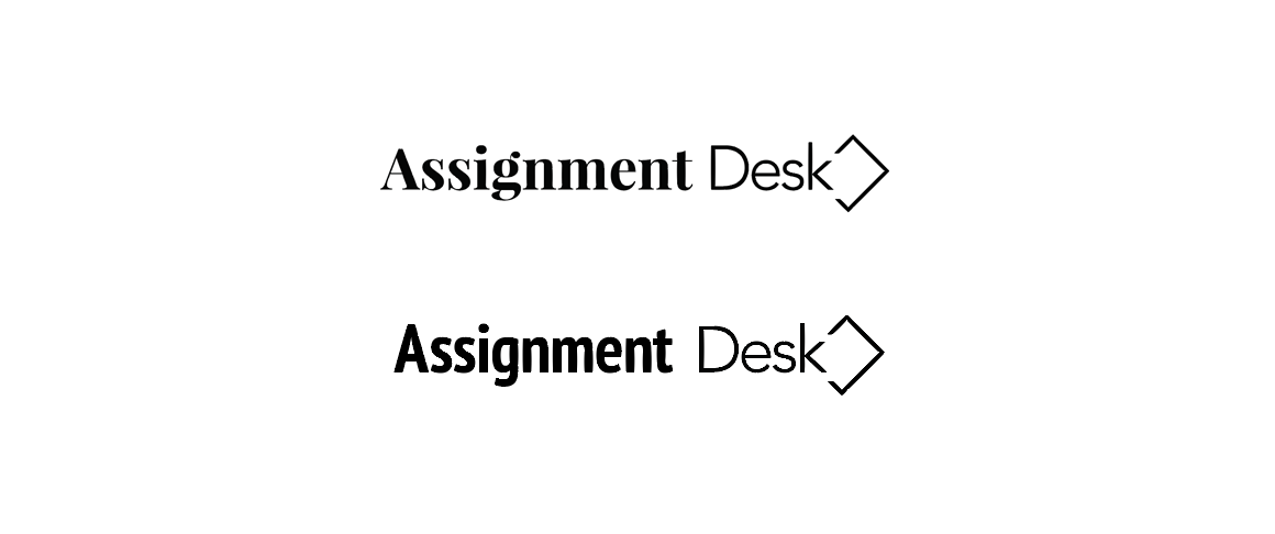
The serif version played off the parent brand’s typography, while the sans-serif version seemed to drive more unity in the logo as a whole. In trying to decide which would work best, I dropped the logos into the only environment they would probably ever see: the Assignment Desk application.
In the end, I decided to go with the sans-serif version because it seemed to fit the context of the application better (as we use sans-serif type everywhere in the application). That reasoning seem to fit because the logo would only ever stand within the context of its application. It wouldn’t really be branded alongside its parent. This made the application feel more like a whole, as a singly-designed thing so to say, which felt like the right choice.
And then there was one...
The application we were building was really only one in a set of many internal tools that were planning on being developed. As such, we explored how the “Assignment Desk” logo might be expanded, both from a visual and branding standpoint, to encompass a suite of “desk” software applications in the future.
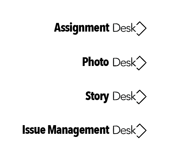
In the end, however, we decided there was too much ambiguity around future application roadmaps to really make any concerted effort towards branding them.
As such, I took the logo I’d arrived at and worked on some fine details like kerning and proportionally fitting and sizing the square/desk shape. I ended up with a slightly more elongated desk shape, which helped balance the negative space of the logo for any bounding box it may appear in, while also (I think) better communicating the idea of a desk visually.