Designing a Successful Transaction Receipt
We were working on getting people to sign up for Kindling through the website and the question came up, “what happens when someone actually signs up? Where do they go? What do they see?” We decided to send people to a “transaction success” page which would reiterate that they had successfully signed up and provide them with additional content to explore. When the page was pushed to our test server, it looked something like this:

As I was busy with other things, the “receipt” aspect of the page had been thought out and developed by other members of the team. But I knew it could use a little love, so I took the initiative to say, “hey, let’s enhance this just a bit.”
I started by first analyzing and understanding the information in the receipt and it’s purpose for being there. Then I jumped into Photoshop to develop a more visual method of communicating the information while keeping in mind the responsive nature of the final product. I decided to borrow the metaphor of a real-world receipt and ended up with a visual draft I shared with the team.
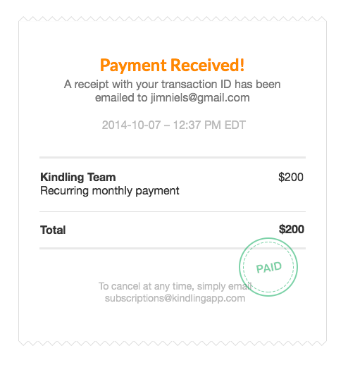
Everyone agreed with the direction of my design, so I transitioned into making it a reality in HTML and everything went live. It felt good to have taken the initiative to enhance this tiny part of the purchasing experience. As a user, it’s nice to see that the care of someone’s product doesn’t go out the door once they have your money.

Soon we decided to make Kindling free for the first month. This begged the question: should we even have a receipt on the success page because nobody is actually being charged for anything? We were, however, collecting credit card information. Whether the person signing up for team was initially paying anything or not, the signing up process felt like a transaction. This led me decide that keeping the visual receipt metaphor was a good thing, but it would need an update.
I changed the way we were presenting the information in the receipt so that it would communicate, “hey, thanks for signing up! Because your first month is free, you won’t be charged anything until {date one month from now}. To cancel at anytime, email us.”
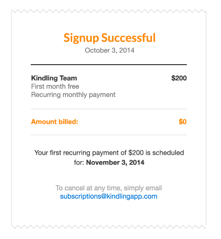
Keeping the receipt metaphor helped maintain the feeling of a successful transaction while simultaneously communicating that the person signing up was not actually being charged for anything (but eventually would be if they didn’t cancel).
Side note: saying you’ll put the date “one month from now” is not as easy as you might think. I ended up engaged in a comical but lengthy discussion with programmers about the exact nature of time. This inevitably lead our conversation to questions like, “what is time, really?” and it’s corollary “what is the meaning of life?”. Lesson? Don’t start talking about dates in computer science with programmers unless you’ve got lots of time your hands.